Bright Spring Colors: Uplift Your Home with Vibrant Transformations
As winter’s gray skies fade and nature begins to bloom, our homes can feel stuck in seasonal limbo. This is where bright spring colors come to the rescue, offering more than just aesthetic appeal—they provide a psychological boost that can transform your living space and your mood. After months of darker, cozier tones, introducing vibrant hues into your home creates an immediate connection to the renewal happening outdoors, bringing energy and optimism indoors. These colors aren’t just about decoration; they’re about creating an environment that supports wellbeing, productivity, and joy during a season of growth and change. The transition from winter to spring represents one of the most dramatic shifts in our environment, and our homes should reflect this transformation. By embracing bright spring colors, you’re not merely redecorating—you’re participating in a seasonal ritual that humans have celebrated for centuries, welcoming light and life back into our personal spaces. This practice goes beyond following trends; it taps into something deeper: our innate response to color and its impact on our emotions and daily experiences. Whether you live in a sunny climate or still face lingering chill, these colors work their magic, creating spaces that feel alive and connected to the season’s energy. In this guide, we’ll explore how to use bright spring colors effectively, from subtle accents to bold statements, ensuring your home reflects the vitality of spring while maintaining harmony and balance. The right approach can make your space feel fresh, inspired, and perfectly attuned to this vibrant season.
Bright Spring Colors That Transform Any Space
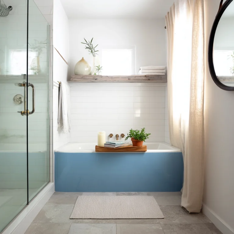
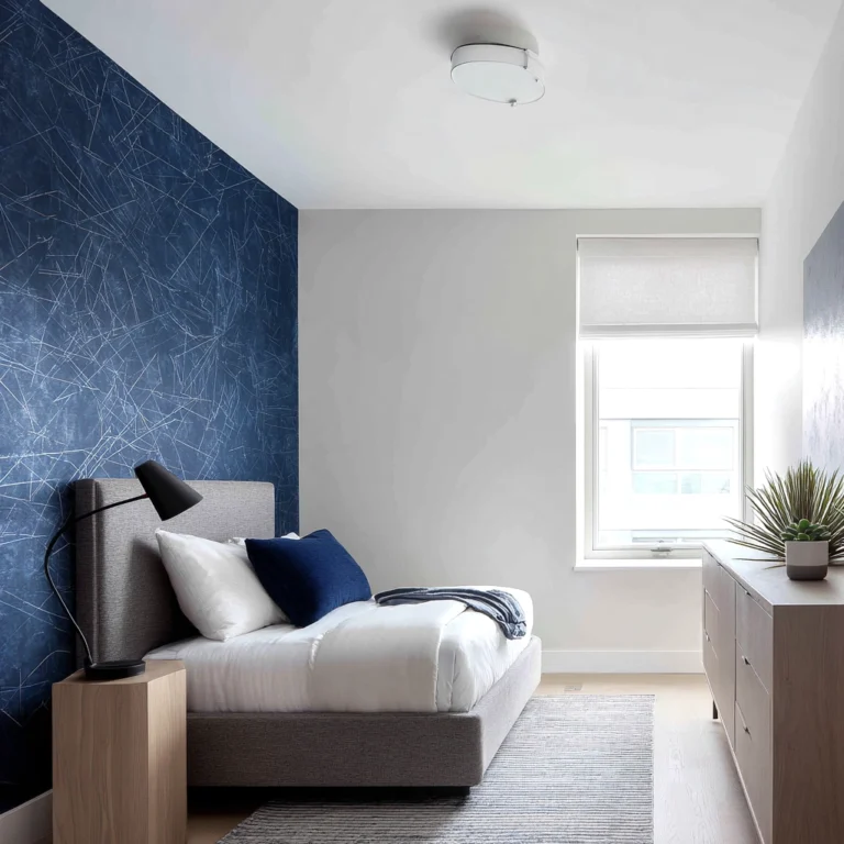
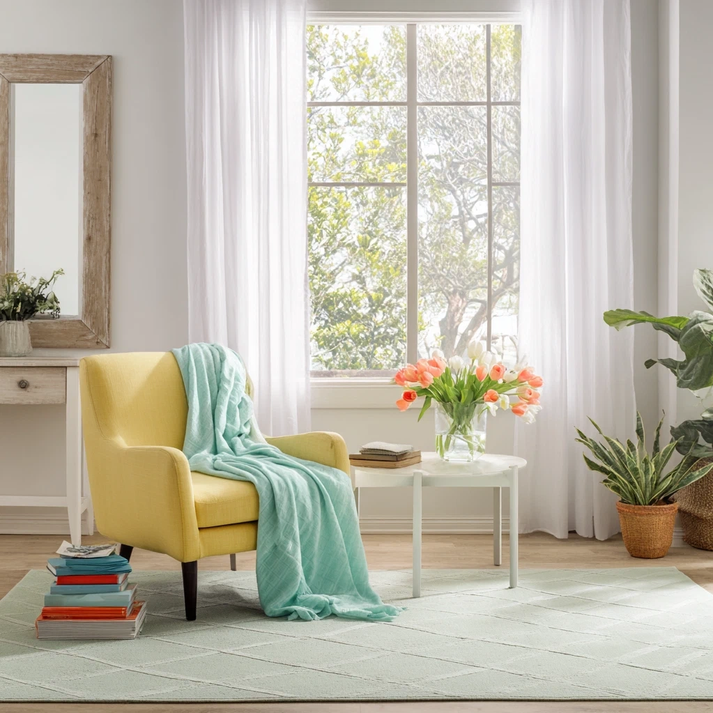
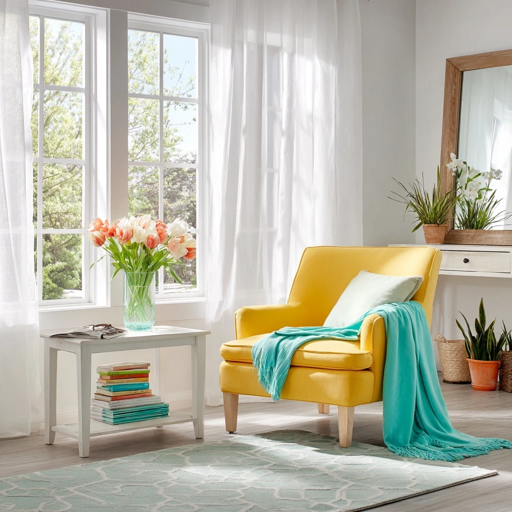
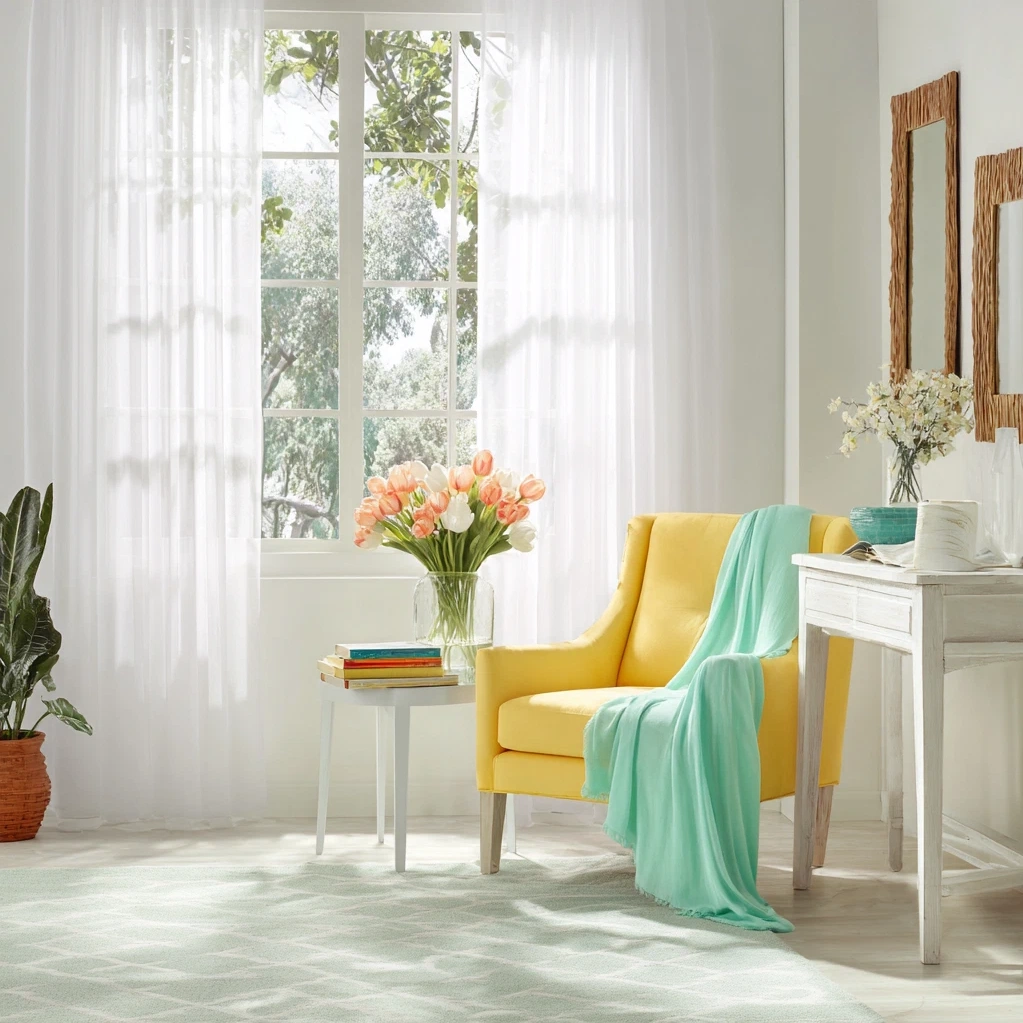
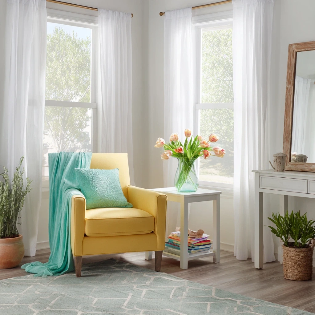
Bright spring colors encompass a spectrum of hues that capture the essence of the season's renewal. Think of the first daffodils pushing through thawing soil—their vibrant yellow speaks of optimism and energy. Or consider the clear, cheerful blue of a spring sky after rain, a color that opens up spaces and creates a sense of airiness. These aren't the muted pastels of Easter decorations but rather saturated, lively tones that command attention while remaining inviting. Emerald green, reminiscent of new leaves, brings nature indoors and pairs beautifully with natural wood tones. Coral and peach tones add warmth without heaviness, perfect for creating cozy yet bright corners. When selecting bright spring colors, consider both the psychology of color and your home's existing elements. Yellow stimulates creativity and happiness, making it ideal for home offices or kitchens. Blue promotes calm and focus, excellent for bedrooms or reading nooks. Green creates balance and connection to nature, working well in living areas. The key is to choose colors that resonate with you personally while considering how they'll function in each room. Test samples in different lighting conditions—morning, afternoon, and artificial light—to see how the colors transform throughout the day. Remember that bright spring colors work best when they have white or neutral companions to prevent overwhelming a space. A bright turquoise accent wall becomes sophisticated when paired with crisp white trim and natural wood floors. Vibrant yellow throw pillows pop against a neutral sofa. These colors should enhance your space, not dominate it. By understanding the emotional impact and practical application of each hue, you can create rooms that feel both seasonally appropriate and personally meaningful year after year.
Incorporating Bright Spring Colors Through Strategic Accents
The most effective way to introduce bright spring colors into your home is through strategic accents that create impact without commitment. Start with textiles—the easiest elements to change with the seasons. Swap out heavy winter throws and pillows for lighter versions in vibrant greens, yellows, or corals. A brightly colored area rug can instantly transform a room's mood, especially in neutral spaces. Consider window treatments in cheerful patterns or solid bright colors that filter spring light beautifully. Table linens offer another opportunity: a set of bright napkins or a vibrant table runner can make everyday meals feel special. Artwork and decorative objects provide perfect spots for color pops. A large piece of art featuring bright spring colors becomes an instant focal point. Vases, bowls, and candle holders in glass or ceramic can hold seasonal flowers or stand alone as colorful statements. Don't forget about functional items: a bright kettle in the kitchen, colorful storage baskets, or even dish towels can add seasonal cheer. For those hesitant about color, start with temporary solutions like removable wallpaper in a small powder room or colorful decals on plain furniture. Fresh flowers and plants naturally bring bright spring colors indoors—arrangements of tulips, daffodils, or ranunculus provide living color that changes as blooms open. Potted herbs like mint and basil add green vitality to kitchen windowsills. The beauty of accent-based approaches is their flexibility; you can rotate colors as the season progresses or as your preferences change. This method allows you to experiment with different bright spring colors combinations without painting walls or making major purchases. As you become more comfortable, you might incorporate larger elements like colorful chairs or statement lighting fixtures. The goal is to create layers of color that feel intentional and harmonious, not random or overwhelming.
Creating Harmonious Spaces with Bright Spring Colors
While bright spring colors bring energy, their successful implementation depends on creating balance and harmony within your spaces. The 60-30-10 rule provides a helpful framework: 60% of a room should be a dominant neutral color (like white, beige, or gray), 30% a secondary color (often another neutral or softer hue), and 10% your bright spring colors as accents. This prevents visual chaos while allowing vibrant elements to shine. Consider color relationships when planning your palette. Complementary colors—those opposite each other on the color wheel—create dynamic contrast: think bright yellow with violet accents, or coral with touches of teal. Analogous colors—those next to each other—create soothing harmony: a progression from yellow to green to blue feels naturally cohesive. Don't overlook the importance of texture when working with bright colors. Matte finishes absorb light and feel sophisticated, while glossy surfaces reflect light and increase vibrancy. Mixing textures—like a velvet pillow in emerald green against a smooth ceramic vase in the same hue—adds depth and interest. Lighting significantly affects how bright spring colors appear. Natural daylight shows colors at their truest, while warm artificial light can soften and warm cool tones. Consider installing adjustable lighting to highlight colorful elements at different times of day. Flow between rooms matters too. Repeating one or two bright spring colors throughout your home creates cohesion. For instance, carry a specific shade of blue from living room pillows to bathroom towels to kitchen accessories. This repetition creates rhythm without monotony. Finally, consider the room's function and existing architectural features. High-energy colors work well in social spaces like living rooms, while softer brights might suit bedrooms. Architectural details like moldings, built-ins, or interesting ceilings can be highlighted with strategic color placement. By approaching bright spring colors with these principles in mind, you create spaces that feel both vibrant and restful—a perfect reflection of spring's balanced energy.
Conclusion
Bright spring colors offer more than seasonal decoration—they provide a powerful tool for transforming our living environments to match nature's renewal. By understanding which hues work best for different spaces, implementing them through strategic accents, and creating harmonious combinations, you can infuse your home with the optimism and energy of spring. This approach goes beyond mere aesthetics; it creates spaces that support wellbeing, inspire creativity, and celebrate seasonal change. As you experiment with these vibrant palettes, remember that personal preference matters most—choose colors that genuinely make you feel uplifted and connected to the season. The beauty of working with bright spring colors lies in their flexibility; you can start small with removable elements and build confidence over time. Looking forward, consider how these principles might extend beyond spring. Many bright colors work beautifully year-round when balanced appropriately. The skills you develop in creating harmonious spaces with vibrant hues will serve you in all seasonal transitions. Most importantly, have fun with the process. Decorating with bright spring colors should feel joyful and experimental, much like the season itself. As you open windows to let in fresh air, let these colors bring fresh energy into your home. They remind us that our living spaces can evolve with us, responding to both external seasons and internal needs. Whether you embrace bold statements or subtle touches, bright spring colors have the power to transform not just rooms, but moods and moments within them.
Frequently Asked Questions
Q: What are the best bright spring colors for small spaces?
For small spaces, choose bright spring colors that enhance light and create a sense of expansion. Clear, light blues and soft yellows work particularly well as they reflect natural light and make rooms feel airier. Avoid dark, saturated versions of bright colors that can make spaces feel cramped. Instead, opt for lighter values of vibrant hues—think buttery yellow rather than mustard, or sky blue rather than navy. Using bright colors as accents against neutral backgrounds (especially white) helps maintain an open feel while adding seasonal cheer. Mirrors placed opposite colorful elements can amplify both light and color impact.
Q: How can I incorporate bright spring colors if I prefer a minimalist style?
Minimalism and bright spring colors can work beautifully together through selective, intentional applications. Choose one or two vibrant hues and use them sparingly but dramatically. A single large piece of art featuring bright colors against a white wall creates strong impact without clutter. Functional items in bright hues—like a vibrantly colored chair or a set of matching kitchen tools—serve dual purposes. Consider architectural applications: painting the inside of open shelving or the back of a bookcase in a bright color adds surprise without visual busyness. The key is maintaining clean lines, uncluttered spaces, and allowing each colorful element to stand as a deliberate statement.
Q: Can bright spring colors work in rooms with limited natural light?
Absolutely—bright spring colors can actually enhance rooms with limited natural light when chosen carefully. Opt for warmer brights like coral, peach, or golden yellow that mimic sunlight's warmth. Avoid cool blues or greens that might feel chilly in dim spaces. Glossy or semi-gloss finishes on colorful elements help reflect whatever light exists. Strategic lighting becomes crucial: use warm white bulbs (2700-3000K) to illuminate colorful accents, and consider adding mirrors to bounce light around. Lighter versions of bright colors work better than deep saturated ones in low-light conditions. Test paint samples or fabric swatches in the actual room at different times to see how colors perform in your specific lighting situation.