Pastel Pink Background: 13 Serene and Stunning Design Secrets
Imagine walking into a room that instantly calms your nerves and lifts your spirits. A pastel pink background offers this transformative power, creating spaces that feel both sophisticated and soothing. This delicate hue has moved beyond nursery walls to become a versatile design choice for modern homes. Its subtle warmth adds depth without overwhelming, making it perfect for creating harmonious environments that promote relaxation and creativity. In today’s fast-paced world, our surroundings significantly impact our mood and productivity. Choosing the right background color isn’t just about aesthetics—it’s about crafting an atmosphere that supports your lifestyle. Pastel pink provides a gentle backdrop that complements various decor styles, from minimalist to bohemian. It reflects light beautifully, making rooms appear brighter and more spacious. This color psychology works wonders in bedrooms for restful sleep, in home offices for focused work, and in living areas for comfortable gatherings. The magic lies in its adaptability; it pairs effortlessly with neutrals, metals, and bold accents. As we explore this trend, you’ll discover how this seemingly simple color choice can redefine your space. Whether you’re renovating an entire room or adding subtle touches, a pastel pink background offers endless possibilities for personal expression. It’s not just about following trends—it’s about creating a home that truly feels like your sanctuary. The following sections will guide you through practical applications and inspiring ideas to help you harness the power of this versatile hue in your own living spaces.
Pastel Pink Background: Creating Calm and Cohesive Spaces
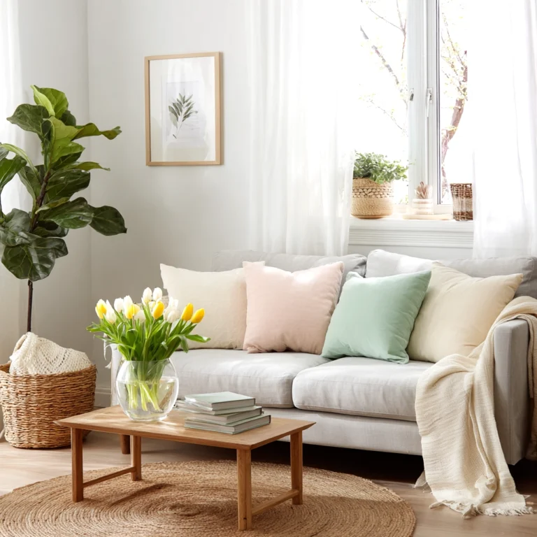
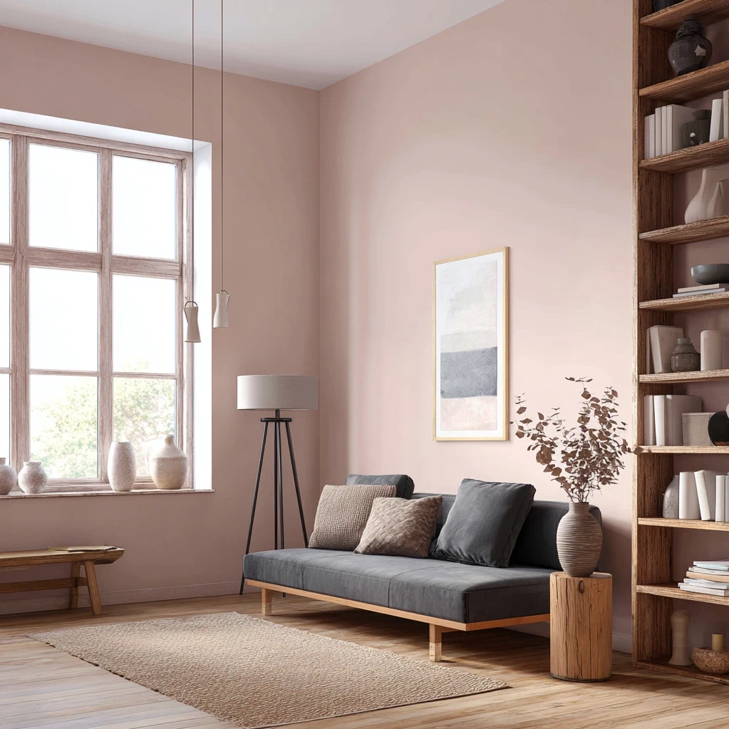
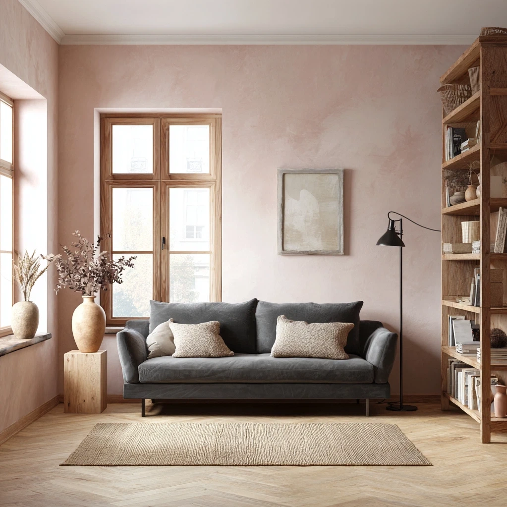
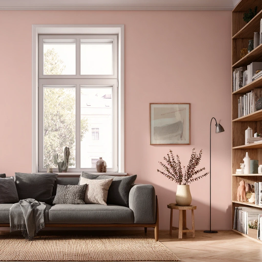
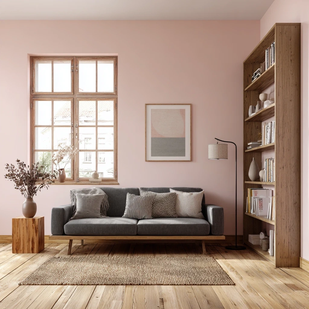
A pastel pink background serves as the perfect foundation for creating serene and unified rooms. This soft hue acts as a neutral with personality, providing warmth without intensity. When used on walls or large surfaces, it establishes a calming atmosphere that permeates the entire space. The key to success lies in choosing the right shade—options range from blush with peach undertones to rosy hues with lavender notes. Consider the room's natural light when selecting your perfect pastel pink. North-facing rooms benefit from warmer tones to combat cool light, while south-facing spaces can handle cooler variations. Application methods vary based on your goals. Full wall coverage creates a dramatic yet gentle backdrop for artwork and furniture. Accent walls in pastel pink add interest without overwhelming smaller rooms. For renters or those hesitant about permanent changes, removable wallpaper offers temporary transformation. Large area rugs with pastel pink patterns can anchor a room while providing visual warmth. Even ceiling treatments in this hue create unexpected coziness. The beauty of a pastel pink background lies in its versatility across different rooms. In bedrooms, it promotes relaxation and pairs beautifully with crisp white linens. Living areas benefit from its welcoming ambiance, especially when combined with natural textures like wood and rattan. Home offices gain focus-enhancing qualities from this psychologically soothing color. Kitchens and dining spaces feel more inviting with subtle pink undertones that complement food presentations. Remember that consistency matters—carry the color through accessories, textiles, or adjacent spaces to create flow throughout your home.
Pastel Pink Background: Perfect Pairings and Color Combinations
The true magic of a pastel pink background emerges when paired with complementary colors and textures. This versatile hue plays well with numerous palettes, allowing for endless creative expression. For a classic and timeless look, combine pastel pink with crisp whites and soft grays. This creates a clean, airy feel perfect for modern spaces. Add metallic accents in gold or brass for subtle luxury. Natural wood tones provide beautiful contrast against pink backgrounds, bringing warmth and organic texture. Darker woods like walnut create sophistication, while lighter oak maintains brightness. Don't shy away from bold combinations—pastel pink with navy blue or forest green creates striking visual interest while maintaining balance. These deeper colors ground the softness of pink, resulting in spaces that feel both cozy and dynamic. Textural elements elevate pastel pink backgrounds significantly. Velvet upholstery in complementary colors adds depth and luxury. Linen curtains in neutral tones filter light beautifully against pink walls. Rattan and wicker furniture pieces introduce natural texture that softens the overall aesthetic. Consider layering different shades within the pink family for dimension. A blush wall might feature salmon-toned artwork or raspberry-hued throw pillows. This monochromatic approach creates sophistication without monotony. Metallic elements deserve special attention when working with pastel pink backgrounds. Copper and rose gold harmonize beautifully, enhancing the warmth of the pink. Silver and chrome offer cooler contrast for more contemporary spaces. Mixing metals adds visual interest—try combining matte black fixtures with gold accessories against your pink backdrop. Pattern integration works wonderfully with pastel pink backgrounds. Floral prints feel fresh rather than fussy against this gentle hue. Geometric patterns in coordinating colors add modern edge. Stripes in varying widths create movement and interest. Remember that your pastel pink background should enhance rather than compete with other elements.
Pastel Pink Background: Practical Applications and Maintenance
Implementing a pastel pink background requires practical considerations for lasting beauty and functionality. Start with proper surface preparation—clean walls thoroughly and repair any imperfections before painting. Use quality primer to ensure even color application and longevity. When selecting paint, consider finish options carefully. Matte finishes hide imperfections well and create soft diffusion of light, perfect for bedrooms and living areas. Eggshell offers slight sheen with good durability for high-traffic spaces. Satin works well in kitchens and bathrooms where moisture resistance matters. For wallpaper applications, measure accurately and consider pattern matching requirements. Removable wallpaper offers flexibility for renters or frequent updaters. Maintenance of your pastel pink background depends on the application method. Painted walls benefit from regular dusting and occasional spot cleaning with gentle solutions. Test cleaning products in inconspicuous areas first to prevent discoloration. Wallpaper requires careful dusting with soft brushes—avoid abrasive cleaners that might damage the surface. Lighting plays crucial role in how your pastel pink background appears throughout the day. Layer lighting sources for optimal effect. Ambient lighting from ceiling fixtures establishes overall illumination. Task lighting in work areas ensures functionality. Accent lighting highlights architectural features or artwork against the pink backdrop. Consider how artificial light affects your color—warm bulbs enhance pink's coziness, while cool bulbs create more contemporary feel. Natural light showcases the color's true beauty, so maximize window treatments that allow light control. For those hesitant about full commitment, start with smaller applications. Pastel pink accent furniture makes bold statement against neutral walls. Textiles like curtains, rugs, or throw blankets introduce the color temporarily. Artwork with pink elements tests the waters before painting entire rooms. Seasonal adjustments keep your pastel pink background feeling fresh year-round. Lighter accessories for spring and summer, richer textures for fall and winter. This adaptability makes pastel pink backgrounds sustainable long-term choices that evolve with your style.
Conclusion
A pastel pink background offers more than just visual appeal—it creates environments that nurture wellbeing and reflect personal style. Throughout this exploration, we've discovered how this gentle hue transforms spaces through careful application, thoughtful pairings, and practical maintenance. The 13 design secrets revealed demonstrate that pastel pink works beautifully across various rooms and styles. From creating calming bedrooms to inspiring home offices, this versatile color adapts to your needs while maintaining its soothing essence. Remember that successful implementation balances aesthetics with functionality. Proper surface preparation, quality materials, and layered lighting ensure your pastel pink background remains beautiful for years. The color combinations discussed—from classic neutrals to bold contrasts—provide endless inspiration for personal expression. As design trends evolve, pastel pink's timeless quality ensures it won't feel dated. Its psychological benefits of promoting calm and creativity make it particularly relevant in today's fast-paced world. Looking forward, we can expect continued innovation in how this hue integrates with smart home technology and sustainable materials. Consider starting small if you're new to this color—perhaps with accent pieces or temporary applications. Notice how different shades affect your mood throughout the day. Most importantly, have fun experimenting with textures and combinations that make your space uniquely yours. Your home should be a sanctuary that supports your lifestyle, and a pastel pink background provides the perfect foundation for creating that personal haven.
Frequently Asked Questions
Q: Will a pastel pink background make my room look too feminine or childish?
Not at all when executed properly. Pastel pink has evolved beyond traditional associations. The key lies in shade selection and pairing. Choose sophisticated shades with gray or beige undertones rather than bright bubblegum pinks. Pair with masculine elements like dark woods, black accents, or industrial metals. In living rooms or offices, combine with leather furniture, concrete textures, or sleek modern lines. The result feels balanced and contemporary rather than overly feminine. Many designers use pastel pink in gender-neutral spaces by treating it as a neutral background that complements various styles.
Q: How do I choose the right pastel pink shade for my space?
Consider three main factors: lighting, room function, and existing elements. Test paint samples on large wall sections and observe at different times of day. North-facing rooms with cool light benefit from warmer pinks with peach or coral undertones. South-facing rooms with abundant light can handle cooler pinks with lavender or gray bases. For bedrooms, choose calming shades that promote relaxation. In social spaces like living rooms, opt for welcoming hues that enhance conversation. Match undertones to existing fixed elements like flooring or cabinetry. Bring fabric swatches and decor items when selecting paint to ensure harmony. Remember that colors appear more intense on large surfaces, so choose slightly lighter than your sample appears.
Q: Can I use a pastel pink background in small rooms without making them feel smaller?
Absolutely—pastel pink can actually make small rooms feel more spacious when used correctly. Lighter shades reflect light beautifully, creating airy impressions. Avoid dark or overly saturated pinks in confined spaces. Use the same color on walls, trim, and ceilings to eliminate visual boundaries that define room size. Incorporate mirrors strategically to amplify light reflection. Keep furnishings streamlined and proportional to the space. Vertical stripes in similar pastel tones can create height illusion. For very small rooms like powder rooms, pastel pink adds personality without overwhelming. The color's gentle nature makes it ideal for creating cozy yet open-feeling spaces regardless of square footage.