Palette Decor Ideas: Transform Your Home with Stunning Color Schemes

Choosing the right color palette for your home decor isn’t just about aesthetics—it’s about creating an environment that reflects your personality and enhances your daily life. The colors surrounding us influence our mood, energy levels, and even our productivity. That’s why investing time in developing thoughtful palette decor ideas can transform a house into a true home. Whether you’re redecorating a single room or undertaking a whole-house makeover, color serves as the foundation upon which all other design elements rest. From calming neutrals to vibrant accent walls, the right color combinations can make spaces feel larger, cozier, or more sophisticated. Many homeowners struggle with color selection, often defaulting to safe choices that don’t truly express their style. This article will guide you through practical approaches to developing color schemes that work for your space and lifestyle. You’ll discover how to balance different hues, incorporate patterns and textures, and create visual flow between rooms. We’ll explore how lighting, furniture, and architectural features interact with your chosen colors to create harmonious environments. Understanding color theory basics will help you make confident decisions rather than relying on guesswork. By the end of this guide, you’ll have actionable strategies for implementing palette decor ideas that elevate every corner of your living space. Let’s dive into the colorful world of home transformation where every shade tells a story and every combination creates atmosphere.
Understanding Color Theory for Effective Palette Decor Ideas
Before diving into specific color combinations, it's essential to grasp basic color theory principles that inform successful palette decor ideas. The color wheel serves as your fundamental tool, showing how primary, secondary, and tertiary colors relate to one another. Complementary colors—those opposite each other on the wheel—create dynamic contrast when used together, while analogous colors—those adjacent—offer harmonious transitions. Warm colors like reds, oranges, and yellows tend to energize spaces and make them feel cozier, whereas cool colors like blues, greens, and purples create calming, serene environments. Understanding value (lightness or darkness) and saturation (intensity) allows you to create balanced schemes. For instance, pairing a highly saturated accent wall with muted furnishings prevents visual overwhelm. Consider how colors behave in different lighting conditions throughout the day. North-facing rooms often benefit from warmer tones to counteract cool natural light, while south-facing spaces can handle cooler hues. Your palette decor ideas should account for the room's function: calming blues for bedrooms, energizing yellows for kitchens, or sophisticated neutrals for home offices. Don't forget about undertones—those subtle color biases that can make seemingly neutral shades appear warm or cool. Testing paint samples on multiple walls at different times of day helps avoid costly mistakes. Remember that colors appear differently on large surfaces versus small swatches. By mastering these fundamentals, you'll create palette decor ideas that work cohesively rather than clashing unexpectedly.
Creating Cohesive Palette Decor Ideas Across Multiple Rooms
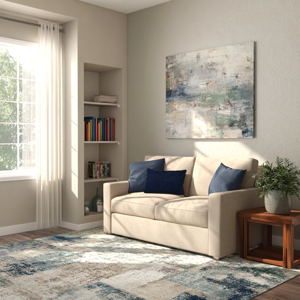
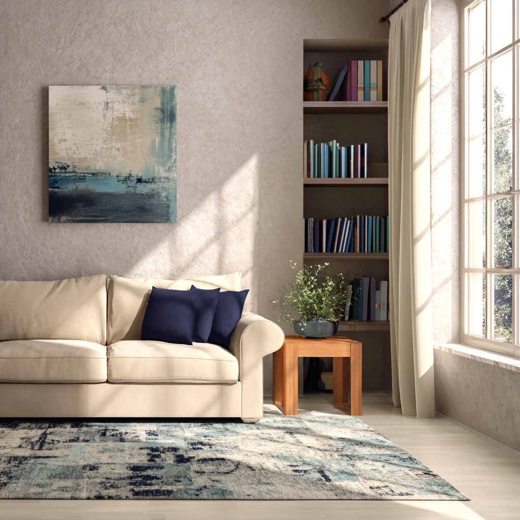
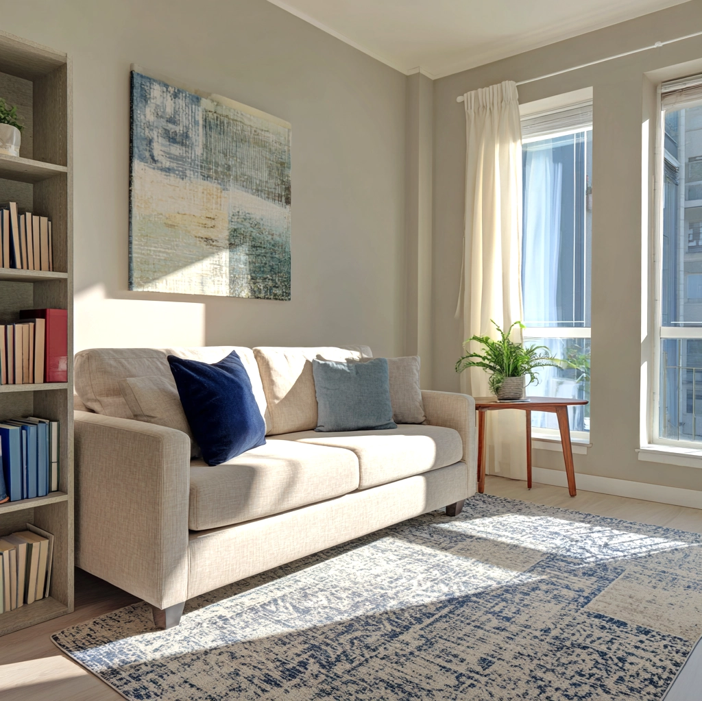
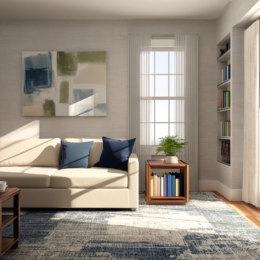
Achieving visual flow between rooms requires strategic planning of your palette decor ideas. Start by selecting a primary color scheme for your home's most public spaces like living rooms and hallways. This establishes a consistent foundation that other rooms can reference. Consider using a neutral base color throughout connecting areas, then introducing variations in adjacent rooms through accent walls or furnishings. For example, a warm gray might flow from entryway to living room, then transition to a blue-gray in the dining area. Doorways and archways provide natural transition points where you can subtly shift hues. Open floor plans present unique challenges since colors must work together in one continuous space. In these cases, define zones through area rugs, furniture groupings, or subtle color variations rather than stark contrasts. Your palette decor ideas should account for sightlines—what you see when standing in one room looking into another. Repetition of accent colors creates rhythm: a mustard yellow pillow in the living room might echo in kitchen accessories or bedroom artwork. Don't forget vertical elements: ceilings painted in lighter versions of wall colors can make rooms feel taller, while darker ceilings create intimacy. Consider how natural light moves through your home throughout the day, affecting how colors transition from morning to evening. Textiles offer flexible ways to tie spaces together—a patterned curtain containing multiple room colors can serve as a unifying element. By thoughtfully planning your palette decor ideas across rooms, you'll create a home that feels intentionally designed rather than randomly assembled.
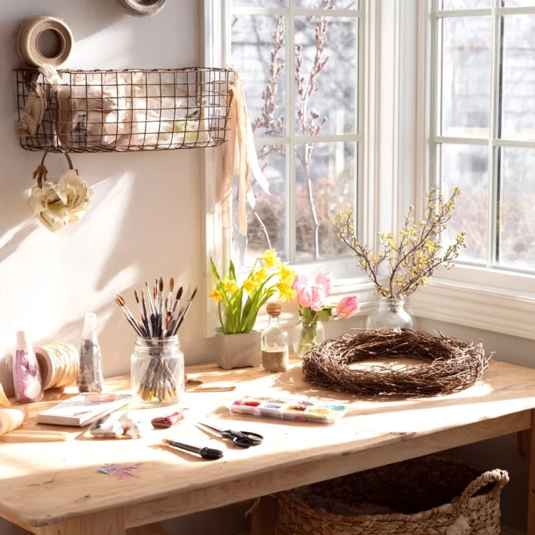
Implementing Seasonal Palette Decor Ideas for Year-Round Appeal
Adapting your color scheme with the seasons keeps your home feeling fresh and responsive to changing light and moods. Spring palette decor ideas often incorporate fresh greens, soft yellows, and floral pinks that reflect nature's renewal. Lightweight textiles in these hues can replace heavier winter fabrics without repainting entire rooms. Summer schemes might emphasize cool blues, aquas, and crisp whites that evoke beach vacations and poolside relaxation. Consider switching out dark accent pillows for lighter versions in similar color families. Autumn brings opportunities for warm, earthy palette decor ideas featuring burnt oranges, deep reds, and golden yellows that mirror falling leaves. Layering textures like wool throws and velvet cushions enhances these cozy tones. Winter color schemes traditionally focus on rich jewel tones or minimalist neutrals, often accented with metallic finishes for holiday sparkle. The key to successful seasonal transitions lies in maintaining a consistent base while rotating accent elements. Your permanent furnishings should work with multiple seasonal palette decor ideas—a neutral sofa can be dressed with spring pastels or autumn rusts equally well. Window treatments offer another seasonal adaptation point: light linen curtains for summer, heavier drapes for winter. Don't overlook natural elements: seasonal branches, flowers, or fruits in complementary colors reinforce your chosen palette. Consider how artificial lighting changes with seasons—warmer bulbs enhance autumn schemes, while cooler bulbs complement summer palettes. By developing a repertoire of seasonal palette decor ideas, you'll maintain visual interest year-round without major redecorating efforts. This approach keeps your home feeling current while respecting your foundational design choices.
Conclusion
Developing and implementing thoughtful palette decor ideas represents one of the most impactful ways to personalize your living space. Throughout this article, we've explored how color theory fundamentals inform successful combinations, how to create cohesive flow between rooms, and how to adapt your scheme with the seasons. Remember that your home's color palette serves as the visual foundation upon which all other design elements rest—from furniture selection to artwork placement. The most successful schemes balance personal preference with practical considerations like room function, lighting conditions, and architectural features. As you move forward with your palette decor ideas, start small with accent walls or accessory changes before committing to full-room transformations. Observe how colors make you feel at different times of day and in various moods. Don't be afraid to experiment—paint samples are inexpensive compared to the satisfaction of finding your perfect combination. Looking ahead, consider how emerging color trends might influence your future palette decor ideas while staying true to what makes you comfortable in your own home. The beauty of color lies in its flexibility: a simple shift in accent hues can completely transform a space's atmosphere. Whether you prefer bold, dramatic contrasts or subtle, monochromatic gradients, your chosen palette should ultimately reflect and enhance your daily life. Let color be your creative tool for crafting spaces that inspire, comfort, and delight everyone who enters.
Frequently Asked Questions
Q: How many colors should I include in my home's overall palette decor ideas?
Most designers recommend a primary palette of three to five colors for your entire home to maintain cohesion without monotony. Typically, this includes one or two neutral base colors (like whites, grays, or beiges), one or two main colors for walls and larger furnishings, and one or two accent colors for accessories and smaller elements. The exact number depends on your home's size and layout—open floor plans might require fewer distinct colors to avoid visual chaos, while homes with many separate rooms can accommodate more variety. Remember that variations of the same color (lighter and darker shades) count as part of your palette decor ideas without adding visual complexity.
Q: Can I mix warm and cool colors in my palette decor ideas?
Absolutely! Mixing warm and cool colors can create dynamic, sophisticated spaces when done intentionally. The key is to establish a dominant temperature direction—either mostly warm with cool accents or mostly cool with warm accents—to maintain balance. For example, a room with cool blue walls might be warmed with wooden furniture (natural warm tones) and mustard yellow accessories. Alternatively, a warm beige room could be cooled with slate blue textiles and silver metallic details. Test combinations in your actual space since lighting affects how colors interact. Many successful palette decor ideas incorporate both temperatures through natural materials like wood (warm) and stone (cool) that bridge the divide.
Q: How do I choose palette decor ideas for small spaces versus large rooms?
For small spaces, lighter, cooler colors tend to make rooms feel more open and airy—think soft grays, pale blues, or creamy whites. Using a monochromatic scheme (variations of one color) can also create the illusion of more space by minimizing visual breaks. In large rooms, you have more flexibility: darker or warmer colors can make expansive areas feel cozier and more intimate. Consider using accent walls in large rooms to define zones without closing off the space. Regardless of size, consistent ceiling colors (typically lighter than walls) help maintain proportion. Your palette decor ideas should always consider the room's natural light—small, dark rooms benefit from reflective finishes and strategic lighting to enhance whatever colors you choose.