The Ultimate Guide to Color Psychology in Interior Design: Transform Your Space with Powerful, Emotional Hues

Have you ever walked into a room and immediately felt calm, energized, or even uncomfortable? That’s the power of color psychology in interior design at work. Colors aren’t just visual elements—they’re emotional triggers that can shape our moods, behaviors, and even our well-being. Understanding how different hues affect us psychologically is one of the most valuable tools in creating spaces that truly serve our needs. From the serene blues of a bedroom to the vibrant yellows of a kitchen, every color choice tells a story about how we want to live in our homes. This guide will explore how colors influence our emotions and how you can harness this knowledge to design spaces that support your lifestyle. Whether you’re redecorating a single room or planning a complete home makeover, mastering color psychology will help you create environments that look beautiful and feel right. We’ll dive into the science behind color perception, explore practical applications for different rooms, and provide actionable tips for combining colors effectively. By the end of this guide, you’ll have the confidence to make color choices that enhance your daily life.
Understanding Color Psychology in Interior Design: The Science Behind Hues
Color psychology in interior design isn't just about personal preference—it's rooted in how our brains process different wavelengths of light. Warm colors like red, orange, and yellow are stimulating because they have longer wavelengths that require more energy to process. This makes them ideal for social spaces but potentially overwhelming in areas meant for relaxation. Cool colors like blue, green, and purple have shorter wavelengths that our brains process more easily, creating calming effects perfect for bedrooms and studies. Neutral colors like white, gray, and beige provide balance and flexibility, allowing other elements to shine while creating a sense of stability. Cultural associations also play a significant role—while white symbolizes purity in Western cultures, it represents mourning in some Eastern traditions. Personal experiences with colors matter too; someone who had a yellow childhood bedroom might find that color comforting rather than energizing. The key to successful color psychology in interior design is understanding these universal principles while considering individual responses. Start by identifying the primary function of each room and choose colors that support those activities. For example, a home office might benefit from blue's focus-enhancing qualities, while an exercise room could use red's energizing properties. Remember that lighting dramatically affects how colors appear, so always test samples in the actual space at different times of day.
Applying Color Psychology in Interior Design to Different Rooms
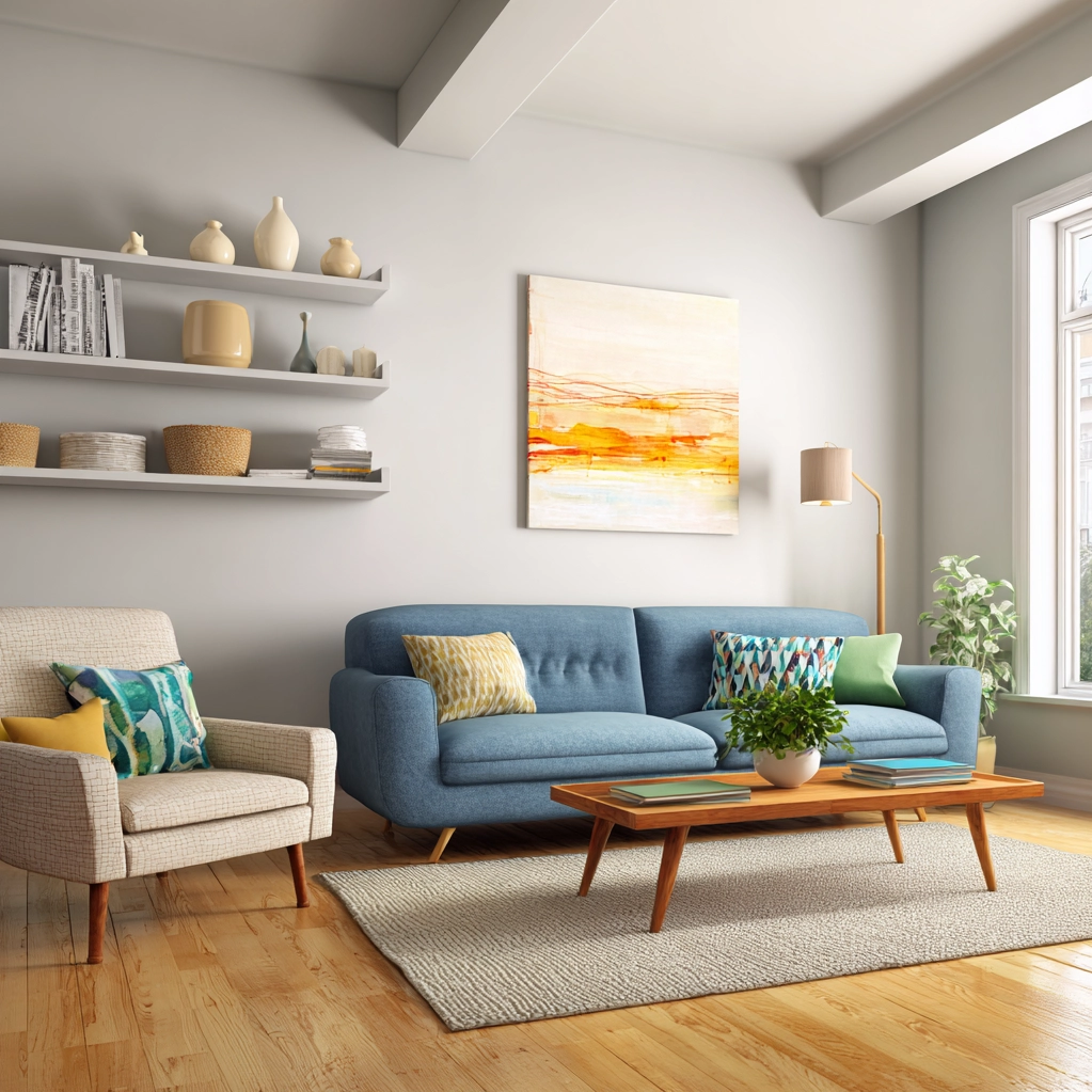
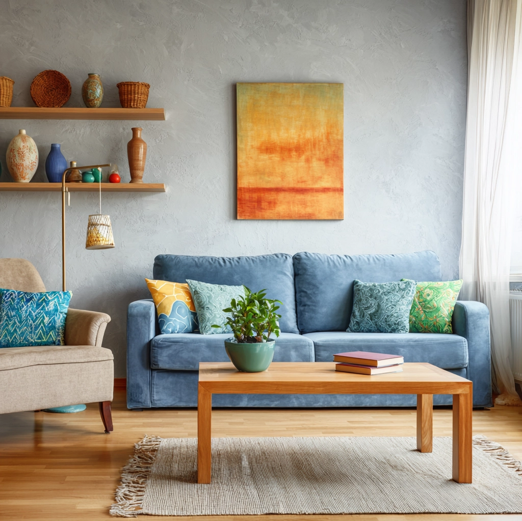
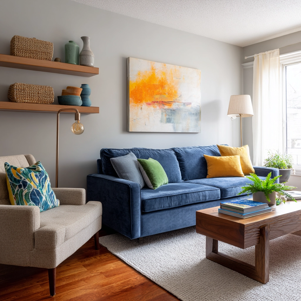
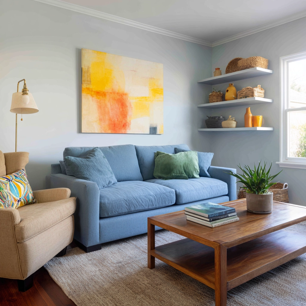
Each room in your home serves different purposes, and color psychology in interior design can help optimize each space for its intended use. Bedrooms benefit most from calming colors that promote rest and relaxation. Soft blues, gentle greens, and muted lavenders lower heart rates and reduce anxiety, making them perfect for creating a sleep sanctuary. Avoid stimulating reds and oranges here, as they can interfere with quality sleep. Living rooms and family spaces should balance comfort with energy. Warm neutrals like taupe or warm gray create cozy atmospheres, while accent walls in terracotta or sage green add personality without overwhelming. Kitchens and dining areas thrive with appetite-stimulating colors. Research shows that warm yellows and oranges can increase hunger and conversation, while red accents can add energy to cooking spaces. Home offices and study areas need colors that enhance concentration and productivity. Blue is particularly effective for focus, while green reduces eye strain during long work sessions. Bathrooms benefit from clean, refreshing colors like light blue or white with aqua accents that evoke water and cleanliness. Children's rooms offer opportunities for creativity—calming colors for sleep areas with brighter accents in play zones. When applying color psychology in interior design, consider the room's natural light, size, and how you want to feel in that space. Small rooms can feel larger with light, cool colors, while large spaces become cozier with warm, darker hues.
Mastering Color Combinations with Color Psychology in Interior Design
Successful color psychology in interior design isn't just about choosing individual colors—it's about how they work together to create harmonious environments. The color wheel provides the foundation for understanding relationships between hues. Complementary colors (opposite on the wheel) like blue and orange create dynamic contrast that energizes spaces when used in proper balance. Analogous colors (next to each other) like blue, blue-green, and green create serene, cohesive looks perfect for relaxing rooms. Monochromatic schemes using different shades of one color add sophistication while maintaining psychological consistency. Triadic combinations (three equally spaced colors) offer vibrant energy suitable for creative spaces or children's areas. When combining colors, consider their psychological weights. A room with too many stimulating colors can feel chaotic, while too many calming colors might lack energy. The 60-30-10 rule provides practical guidance: 60% dominant color (walls, large furniture), 30% secondary color (accent walls, curtains), and 10% accent color (decor, pillows). Texture and finish also affect color psychology—matte surfaces absorb light for softer effects, while glossy finishes reflect light for more intensity. Natural materials like wood and stone introduce organic colors that ground artificial hues. Remember that color psychology in interior design works best when colors flow naturally between connected spaces. Create transitions using shared accent colors or gradually shifting hues rather than jarring changes. Test combinations in small areas before committing, observing how they make you feel at different times and under various lighting conditions.
Conclusion
Color psychology in interior design offers a powerful framework for creating spaces that not only look beautiful but also support our emotional and psychological well-being. By understanding how different hues affect our moods and behaviors, we can make intentional choices that transform our living environments into true sanctuaries. Remember that successful color application considers both universal principles and personal responses—what works for one person might need adjustment for another. Start small if you're new to color psychology; paint an accent wall or introduce colorful textiles before committing to entire rooms. Pay attention to how colors make you feel throughout the day and adjust accordingly. The future of color psychology in interior design continues to evolve with new research on how light and color affect circadian rhythms, productivity, and even physical health. Smart lighting systems now allow dynamic color changes throughout the day, supporting natural energy patterns. As we spend more time in our homes, thoughtful color choices become increasingly important for maintaining balance and happiness. Your home should be a reflection of who you are and support how you want to live. With the principles of color psychology as your guide, you can create spaces that truly enhance your quality of life, one thoughtfully chosen hue at a time.
Frequently Asked Questions
Q: How does color psychology in interior design differ for small spaces versus large rooms?
Color psychology principles remain consistent regardless of room size, but application strategies differ. In small spaces, light and cool colors like pale blue, soft green, or light gray can make rooms feel more spacious and airy by reflecting light. These colors also create calming effects that prevent small spaces from feeling cramped. For large rooms, warmer and darker colors like deep terracotta, rich navy, or chocolate brown can make expansive areas feel cozier and more intimate. The key is maintaining the psychological intent—if you want a small bedroom to feel restful, light blues work well; if you want a large living room to feel welcoming, warm neutrals with rich accents achieve that goal. Always consider the room's natural light, as this dramatically affects how colors appear and influence mood.
Q: Can color psychology in interior design help with specific emotional needs like reducing anxiety or boosting creativity?
Absolutely. Specific colors can target particular emotional states effectively. For reducing anxiety, soft blues and greens are particularly effective as they lower heart rates and blood pressure while creating feelings of tranquility. Lavender and soft gray also provide calming effects. To boost creativity, consider yellow which stimulates mental activity and optimism, or orange which encourages enthusiasm and social interaction. Purple combines blue's calm with red's energy, supporting creative thinking. For spaces needing both calm and creativity, like home studios, blue-green balances focus with inspiration. Remember that personal associations matter—if you have positive memories with a particular color, it may work better for you than general recommendations. Test colors in your space and observe how they affect your mood over several days.
Q: How important is lighting when applying color psychology in interior design?
Lighting is crucial—it can completely transform how colors appear and affect us psychologically. Natural daylight shows colors most accurately and provides full-spectrum light that supports our circadian rhythms. North-facing rooms with cool light work well with warm colors to balance the temperature, while south-facing rooms with warm light benefit from cooler colors. Artificial lighting matters too: warm white bulbs (2700-3000K) enhance reds, oranges, and yellows, creating cozy atmospheres, while cool white bulbs (3500-5000K) make blues and greens appear more vibrant, supporting alertness. Consider how colors will look at different times—a blue that feels serene in morning light might feel cold under evening lamps. Always test paint samples on multiple walls and observe them throughout the day before making final decisions. Layered lighting with different color temperatures gives you flexibility to adjust a room's mood as needed.